Published in The Clarity Journal 82 – 2020.
Background
Northwest Justice Project (NJP) and the Superior Court of Washington have long relied on plain language and readable design to support people who want access to legal forms and information, but do not have lawyers. In 2018, NJP asked Transcend to create 6 new legal icons to enhance the readability of their family law document assembly project. These new icons are now included in the legal icons set at transcend.net. NJP uses the icons to support step-by-step court form instructions on The icons provide a visual summary of each step, aiding comprehension and making a complex process feel more manageable.
The purpose of this article is to share the various testing methods used to ensure the legal icons conveyed their intended messages. We detail the testing steps below.

NJP requested icons for these phrases:
- Review your forms
- Sign
- Copy [forms] (show the number of copies)
- Deadline
- Parenting Plan
NJP provided “inspiration” icons from nounproject.com, and asked Transcend to create and test icons that matched the style of Transcend’s existing set of 200+ legal icons.
Usability testing procedure
1. Research / identify existing icons
Our first step was to collect existing icons for these phrases. Icons were selected
based on a google search of each phrase.
2. Preference test existing icons
We next did individual preference testing with 5-12 users of existing icons to ask users which image they most preferred for each phrase.
How to Preference Test
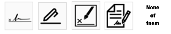
Show each user the inspiration image along with other popular icons for each phrase. Ask, “Which icon do you think best represents the phrase: ?”
Example:
Which icon do you think best represents the phrase “Sign”?
Maria Mindlin is CEO of Transcend, a company that provides plain language and translation services to courts and agencies in the U.S.
She also teaches and trains others in the legal sector so they can learn more about readability and user testing. Maria’s work integrates today’s technologies with plain language, accessibility, and design.
If you chose “None of them”, do you have a suggestion for a better icon for this phrase?
At the end of this test, the icon with the most votes was redesigned to match the style of our previous icon set. It was ready for the next phase.
3. Test icon recognizability (icon only)
In this phase, we tested the icons for recognizability. We showed 3 new participants the icons and asked what each icon meant to them. We said:
“I am going to show you some pictures of things you might find on a legal
website or in legal self-help documents.
I’d like you to tell me what you think they mean. There are no right or wrong answers. It’s OK if a picture has NO meaning for you. You can just say, I don’t know. All answers are OK. The information you give us helps us get better.”
Two of the icons (Review & Copy) did not test well. But because these icons would not be used in isolation; i.e., they would appear next to text, we decided to test them in-context with text.
4. Test icons in-context (icon with text)
Each participant was shown some icons next to typical text and asked to rate how well they communicate a particular phrase.
Example:
Look at the picture for # 8. Now look at the words. Does this picture do a good job communicating Deadline?
8. Write down the deadline for your court form.
Participants were asked to rate their answers using the following scale:
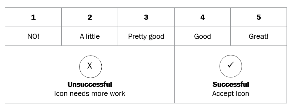
Icons rated Good or Great were considered a success. The icons were accepted without further changes. Only Print & Sign were deemed successful by every participant.
5. Get more input on unsuccessful icons
The 4 other icons (Review Your Forms, Copy, Deadline, Parenting Plan) received low ratings. At the end of each test, we asked each participant for more input on each of these icons.
The artists and production team then translated the participants’ input to revise the icons; this triggered a new round of in-context testing, with new users.
6. Iterative testing on unsuccessful icons
It took several more rounds of iterative testing, feedback, and reworking the icons to produce icons for “Parenting Plan”, “Copies”, “Deadline” & “Review” that participants successfully connected with.
Customized copy icon
NJP requested a customizable copy icon where the user could specify the number of copies required.
We conducted a preference test at Usability Hub, asking “Which image best
represents the phrase ‘5 copies’. Please explain why you chose this option”.
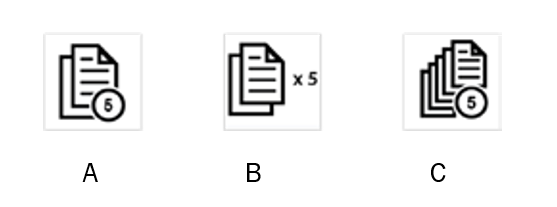
Choice B got the most votes as it appeared less cluttered and most effective to the participants.
Further testing helped us determine that some users would have difficulty figuring out how to use the customizable version of this icon, so we created a How-To video here.
Summary
Effective images can do much to enhance access to legal information and court forms and websites. Testing them is not that difficult. Follow the basic steps outlined in this article, including:
- Research/Identify existing icons
- Conduct preference testing
- Conduct recognizability testing
- Conduct in-context testing
- Get feedback on unsuccessful icons
- Rework unsuccessful icons
- Conduct iterative testing until Icons are successful
The aim of Clarity — the organization — is “the use of good, clear language by the legal profession.”
With that in mind, what path would you like to see the journal take? Do you have an article you
would like published? Can you recommend authors or potential guest editors? No organization or publication can survive for long if its members
(or readers) are not gaining something of value. How can Clarity help you? Please contact editor-in- chief Thomas Myers at clarityeditorinchief@gmail. comwith your suggestions and other comments.
Become a member Membership with Clarity connects you with the leaders in this growing field of expertise, and gives you access to the latest plain language research, the best resources and valuable advice.
Membership includes:
• a subscription to The Clarity Journal
• discounted registration for Clarity conferences and partner conferences and trainings
• access to local and regional activities organised by Clarity country representatives.
Memberships run from 1 January to 31 December each year. If you join after 1 September, your membership will be extended to 31 December of the following year.
Membership is USD50 a year To join,
visit www.clarity-international.net/renew/join-clarity
Honor roll of donors to Clarity Clarity is managed entirely by volunteers and is funded through membership fees and donations. We
gratefully acknowledge those financial supporters who have contributed to Clarity’s success:
$2,500+
Plain English Foundation Anonymous (1)
$1,000+
Christopher Balmford Joseph Kimble
Julie Clement